

New Background


 I have been wanting something for the background of the site for a while...but hadn't found what I really wanted, until I looked over at 1Greeneye. Lee is brilliant and talented...I love her patterns, textures, and brushes! Trouble is, now I can't decide what to use. I narrowed it down to these three styles then modified the coloring a bit with Lee's permission to better match the site. I am planning on toning down or completely removing most of the gray things remaining on the site, including changing the sidebar headings to match the banner font and color...so don't worry if it looks funny with that. The current background is also from Lee's art, and that would be number 6.
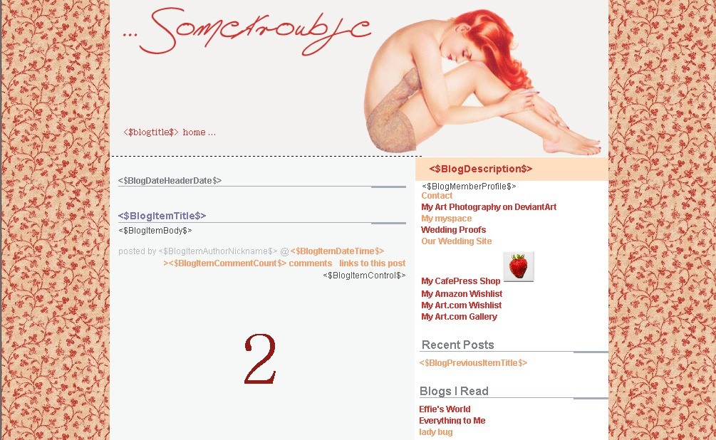
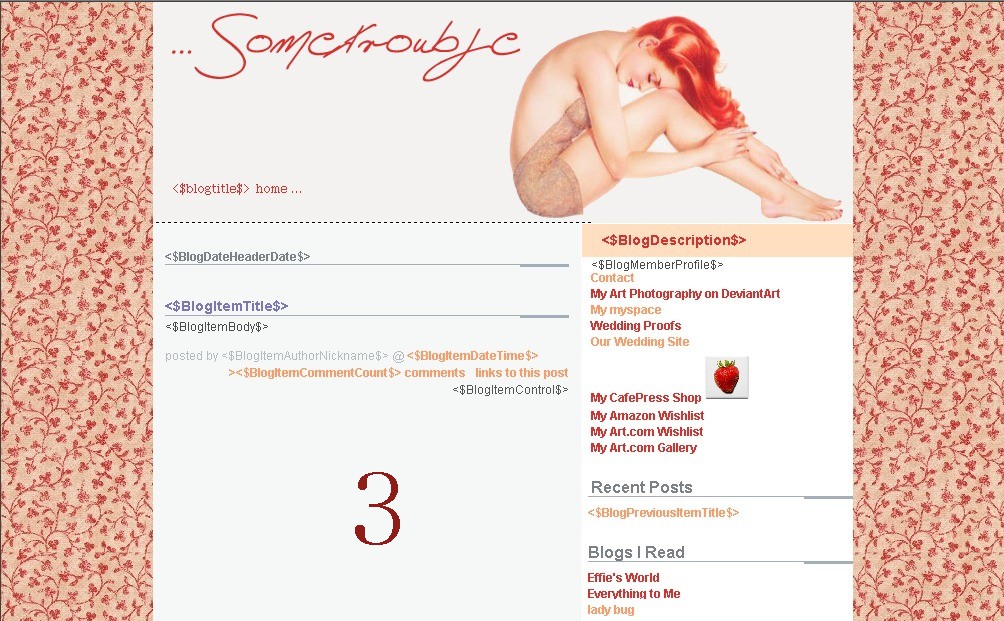
 I can't make up my mind, so even if you normally never comment...please give me your opinion. You can full view the samples if you click them. Thanks!
Labels: proud to be nerdy
5 Comments:
I like the one you have up. Option 6. It's softer so it doesn't jump out at you but completes the site and ties in the other colors you are using.
So, that's my input :)
or option 5 :)
I'm going with 5!
3 is also cute. Now I have to go over there and look myself, because my bloggy needs a facelift too!
I think I like 2,3,4. For some reason, the ones with the darker flower pattern seem to look better. Hope this helps!
I dunno if the voting is over, but I love the one you have up! It's cool!
Post a Comment
<< Home